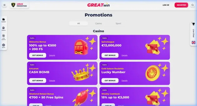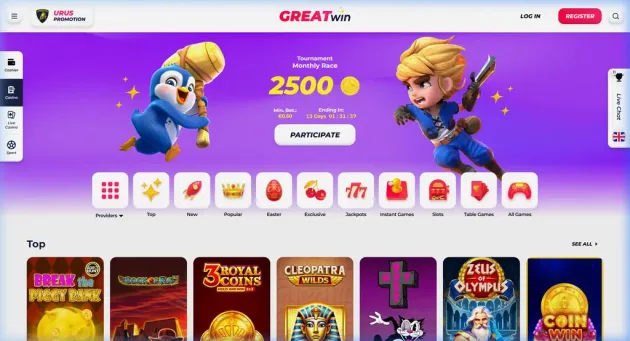

GreatWin is a newer Curacao profile casino and sportsbook brand with a launch history around 2023. The casino side is built around a familiar but useful formula: a €500 welcome package, 200 free spins, weekly cashback, reload offers, a large game library and a broad cashier with fiat and crypto routes.
The review angle should stay practical. GreatWin does not need inflated language around its name or early market presence. It needs to be judged by how the bonus terms, game supply and payment options fit together. The site has enough casino content for a proper review, but its shorter operating history still matters compared with established European brands.
That makes GreatWin more interesting as a value comparison than as a reputation pick. It has the expected modern mix of slots, live dealer tables, sports betting and recurring promotions, yet the brand still has to prove consistency over time. A fair review should give credit for the product range while keeping the verdict grounded in terms, licensing and payout conditions.