32Red launched in 2002 under a former Ladbrokes executive. It listed on the London Stock Exchange before Kindred Group bought it for £176 million in 2017. Kindred later moved under the French state linked FDJ group. Ownership has changed a lot, but the brand keeps the profile of a established UK casino rather than a new gambling startup. The brand also has old football visibility through Aston Villa, Derby County and Middlesbrough shirt deals.
Platform feels distinctly British. It leans into an early 2000s casino style rather than chasing a newer app focused look. 32Red built its reputation on the Microgaming download client back when browser casinos were unstable. That client is gone now. Web version handles everything. They hold UKGC and Gibraltar licenses.
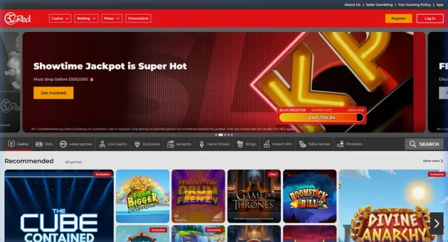
Navigation is simple. Menus separate casino, live casino and sports betting products clearly. No gamified avatars or complex progression maps clutter the screen. 32Red still behaves like a legacy UK casino: familiar categories first, experiments later.